Supply
Customization
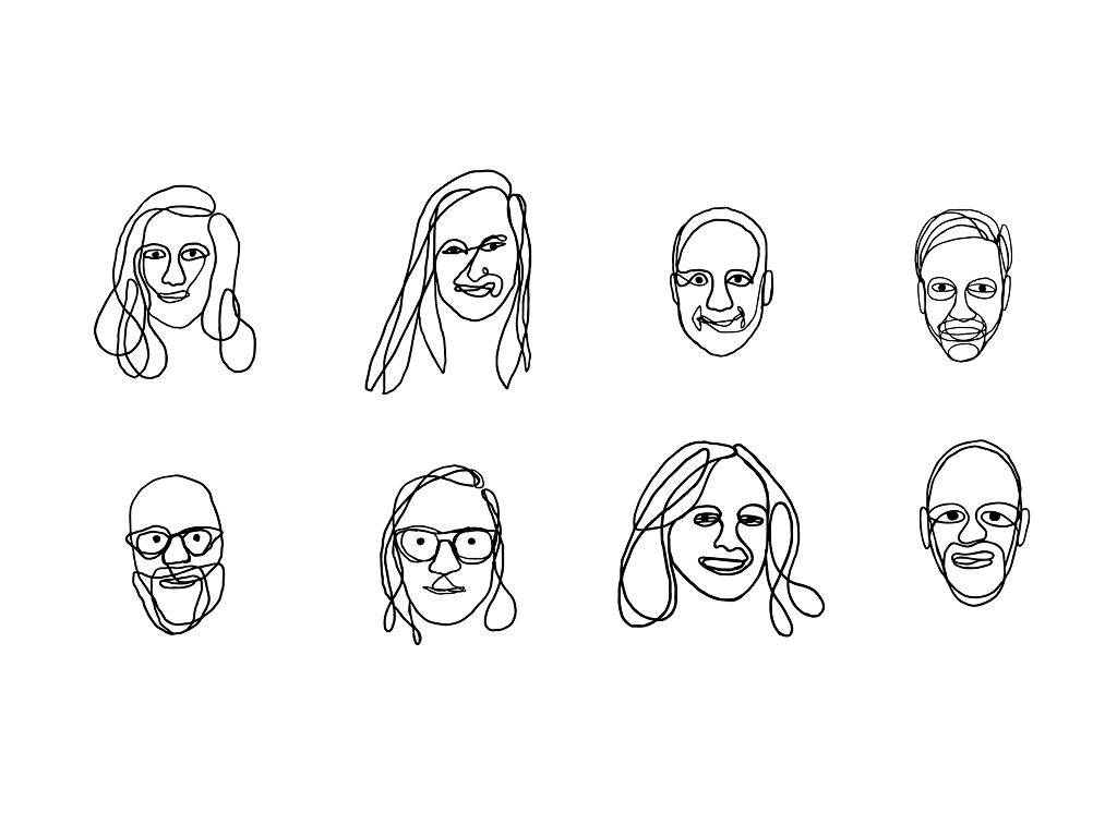
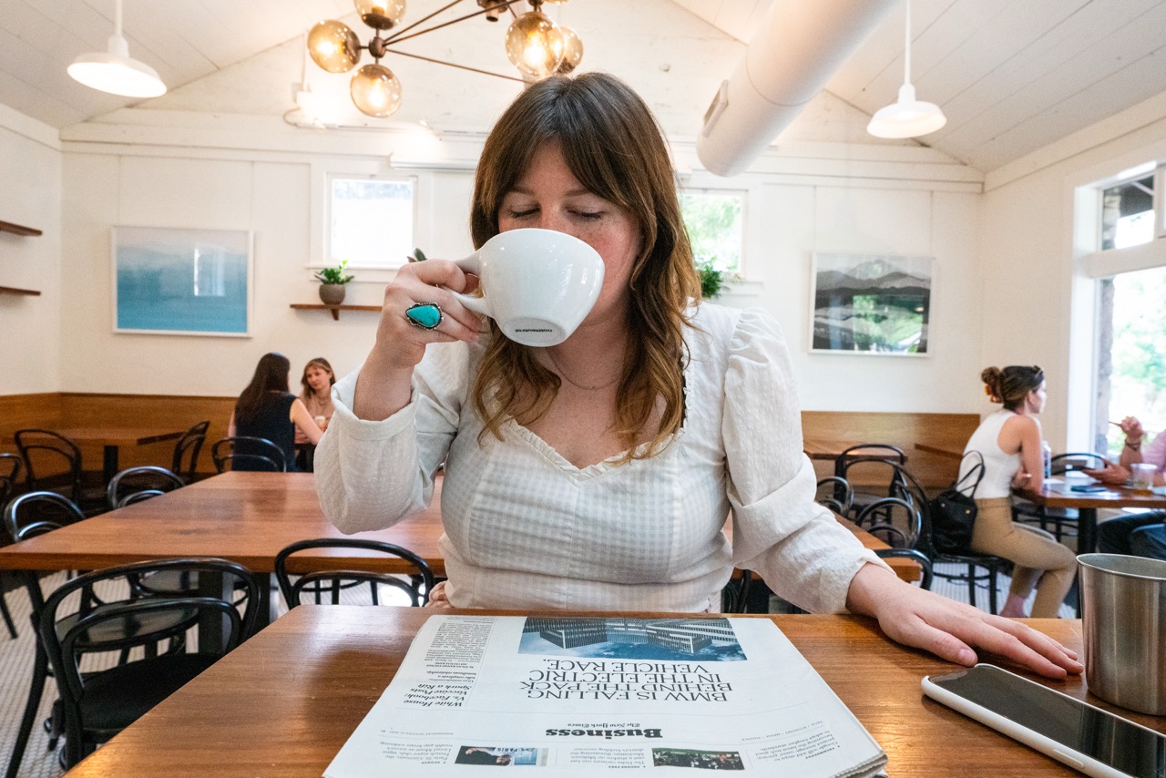
Selected Work
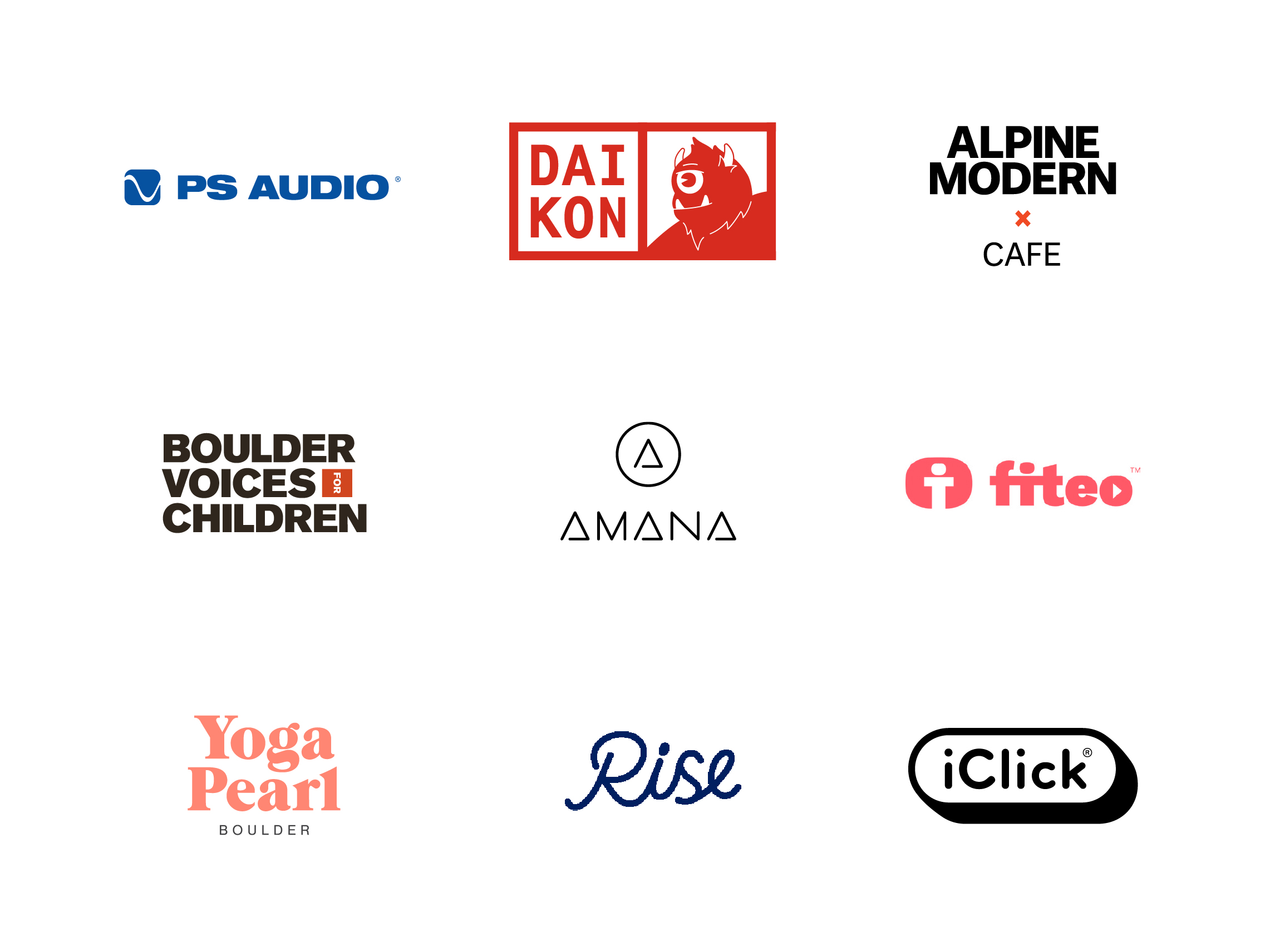
A selection of visual work across branding, product, and illustration: Photobucket, Arcadia, Origin, Urban Habitat Project, Canard, Daikon, Alpine Modern, and OneClock.
Worked on redesigning and modernizing Photobucket as it shifted from a legacy photo hosting site into a more private, social-first platform. Collaborated closely with product, engineering, and leadership to rethink core parts of the experience like uploading, organizing, and sharing photos. A big focus was simplifying clunky workflows and making the product feel more intuitive and cohesive overall. Contributed to building a more consistent design system while helping guide the platform toward a more personal, privacy-forward direction. A mix of quick improvements and bigger-picture thinking to help move the product forward.


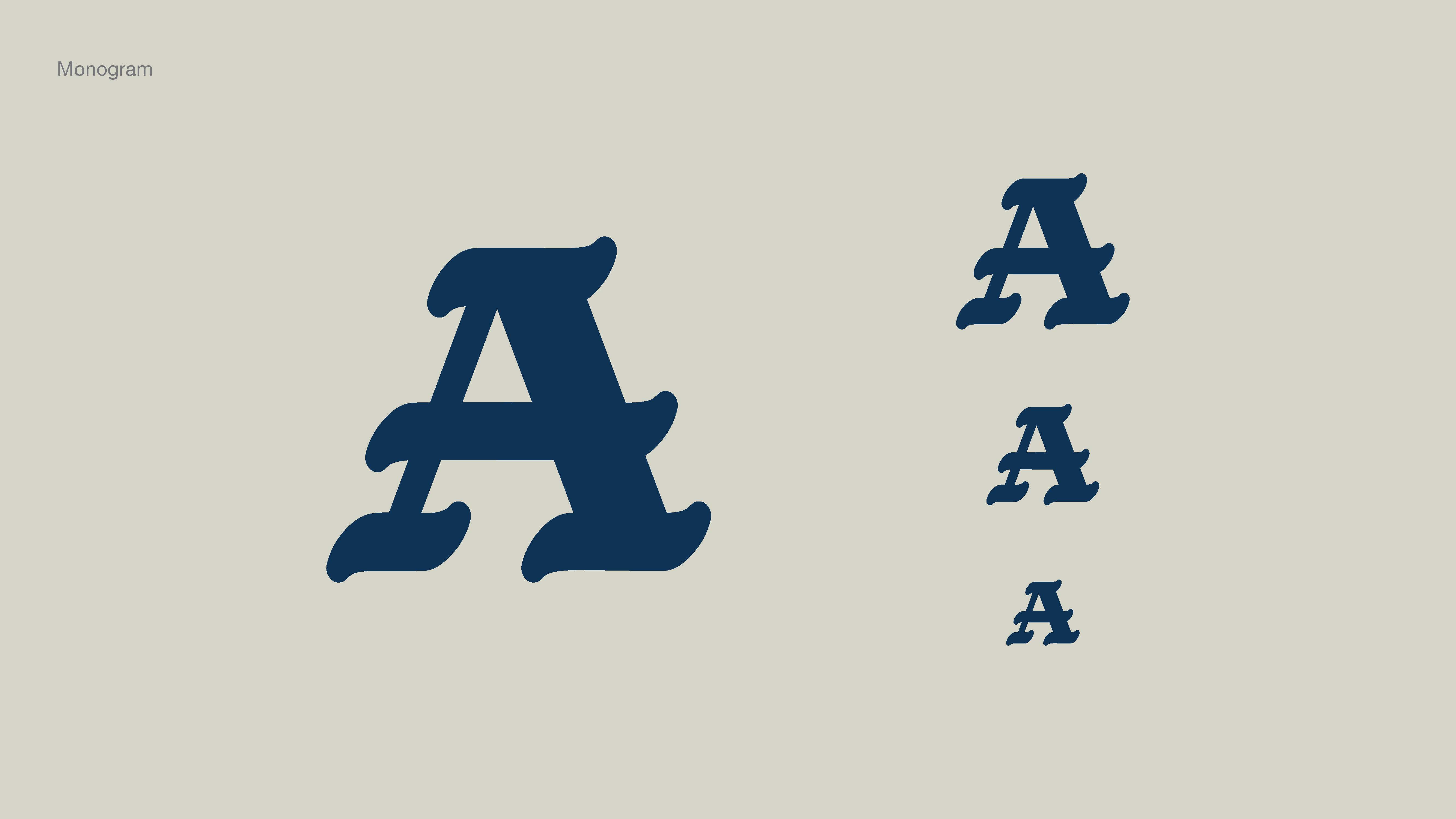
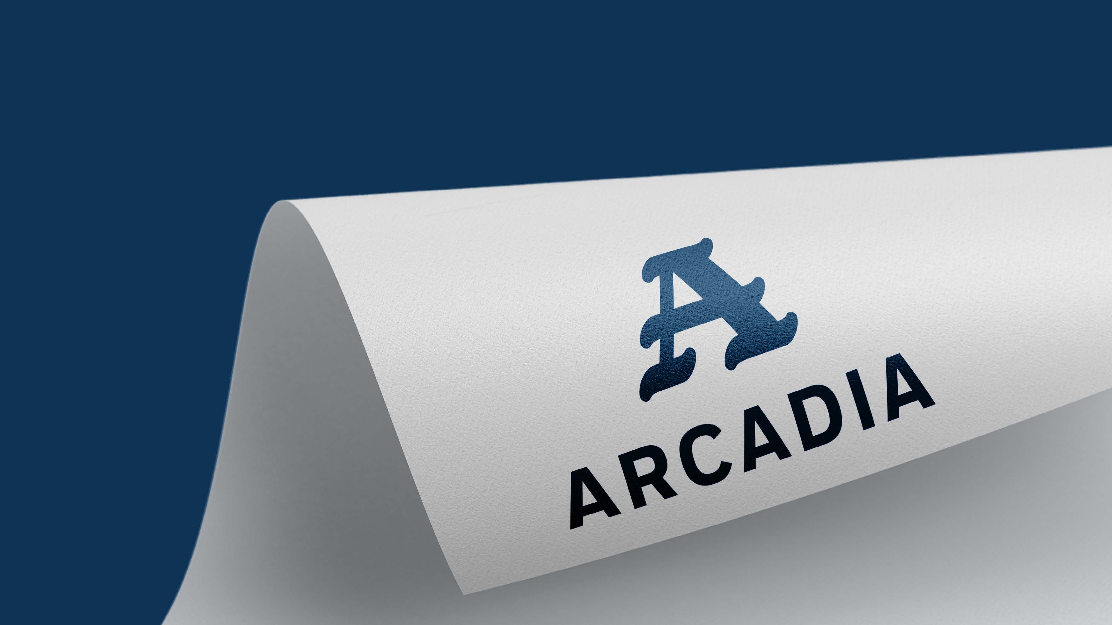
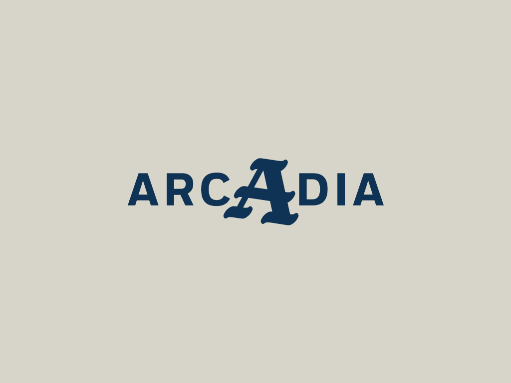
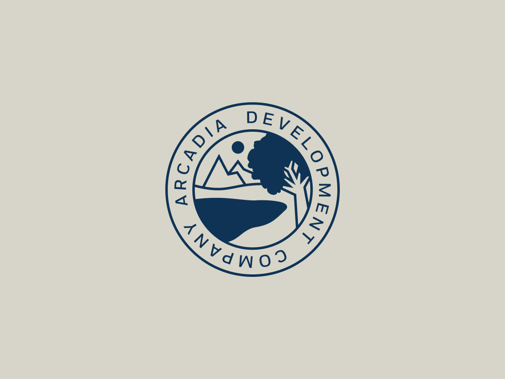
Brand refresh for a generational real estate company with deep roots and a quietly iconic reputation. Arcadia operates across residential, commercial, and development — a broad portfolio held together more by legacy and word-of-mouth than any formal brand presence. The challenge was giving that identity something tangible without losing what made it trusted in the first place. The work centered on a timeless wordmark and visual system built around values like family, patience, and integrity. Classic and simple, with an Old English element as a signature nod to the company's history. The goal was a brand that longtime employees would feel proud of and new hires could actually orient around — something that felt as established as the company itself.
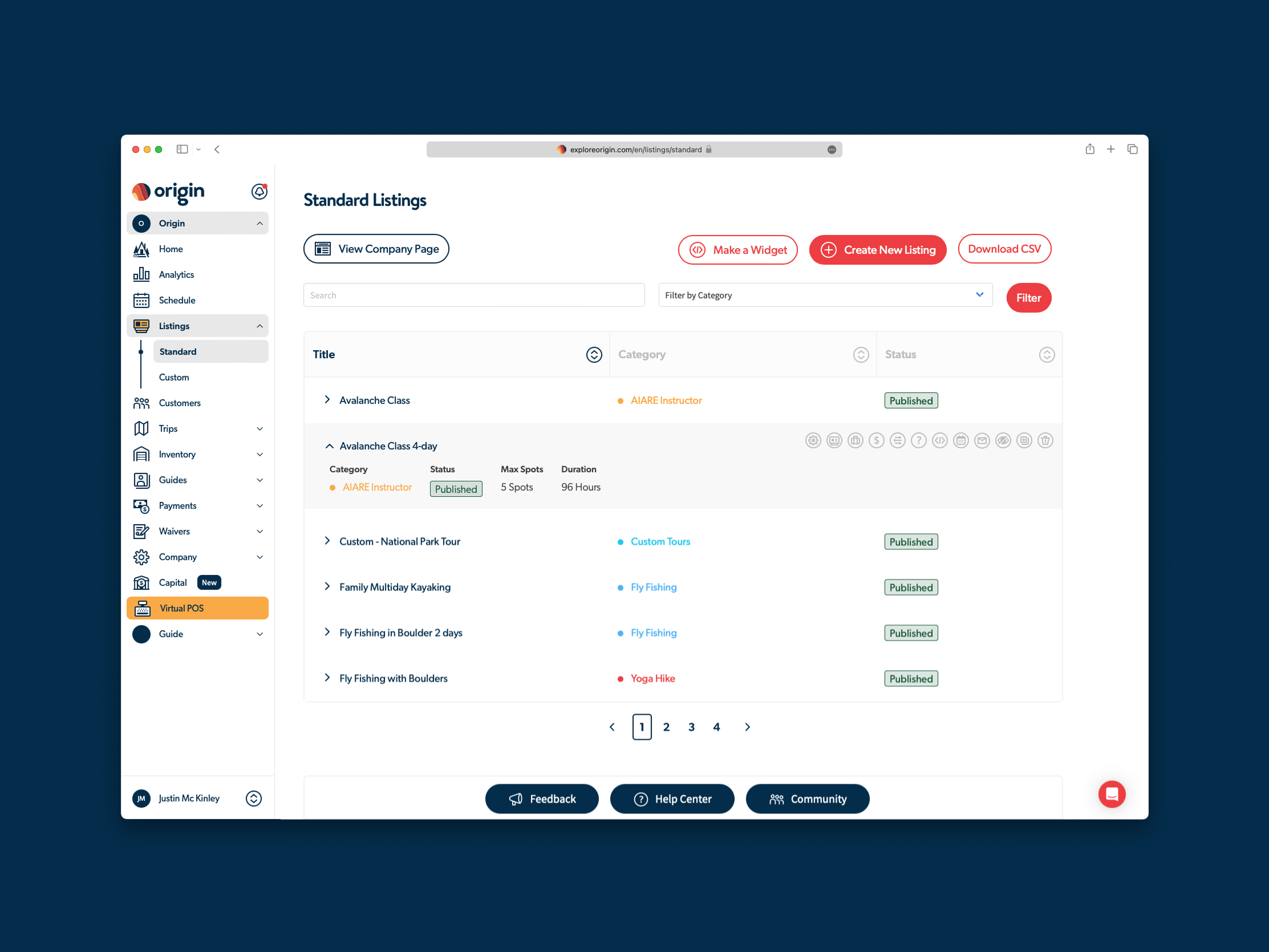
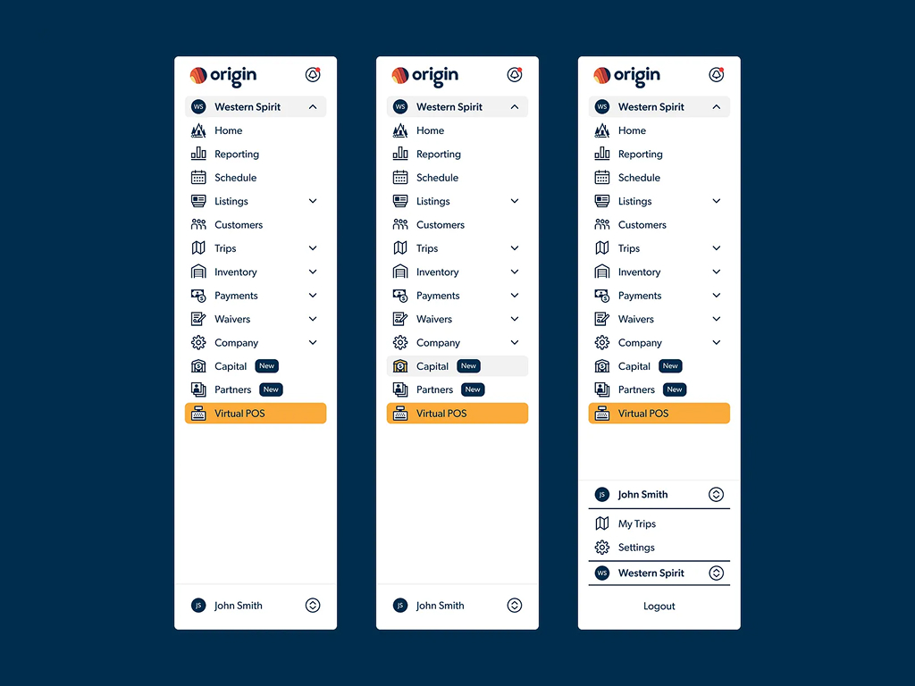
Booking and operations software for outdoor guides and adventure companies. As Head of Design at a small startup, the role covered a lot of ground — product, marketing, and everything in between. Most of the focus went toward designing new features and refining the visual language of a product that already had a real, active user base depending on it. That tension between moving fast and not breaking things people rely on shaped most of the decisions. Worked to bring more consistency and clarity to the product while keeping it functional and shippable throughout.


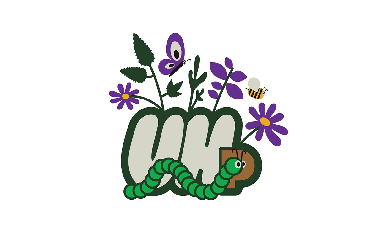
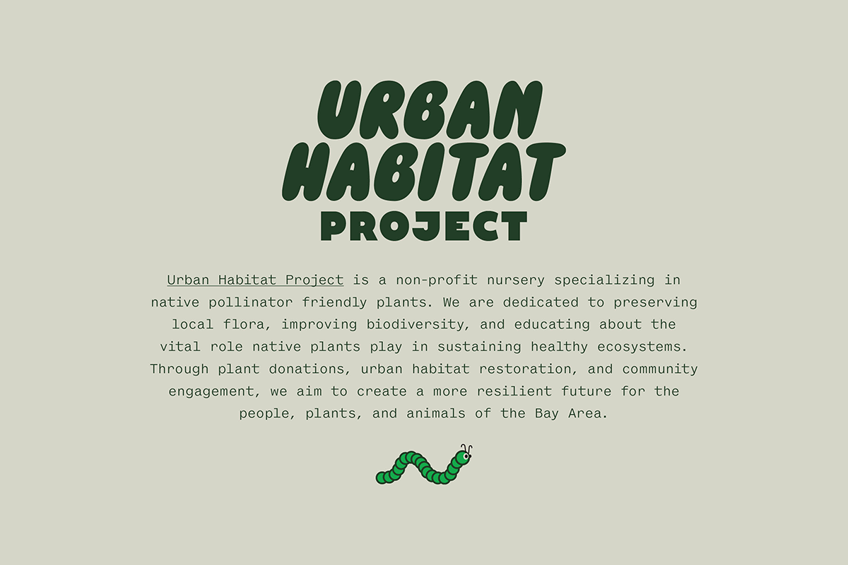
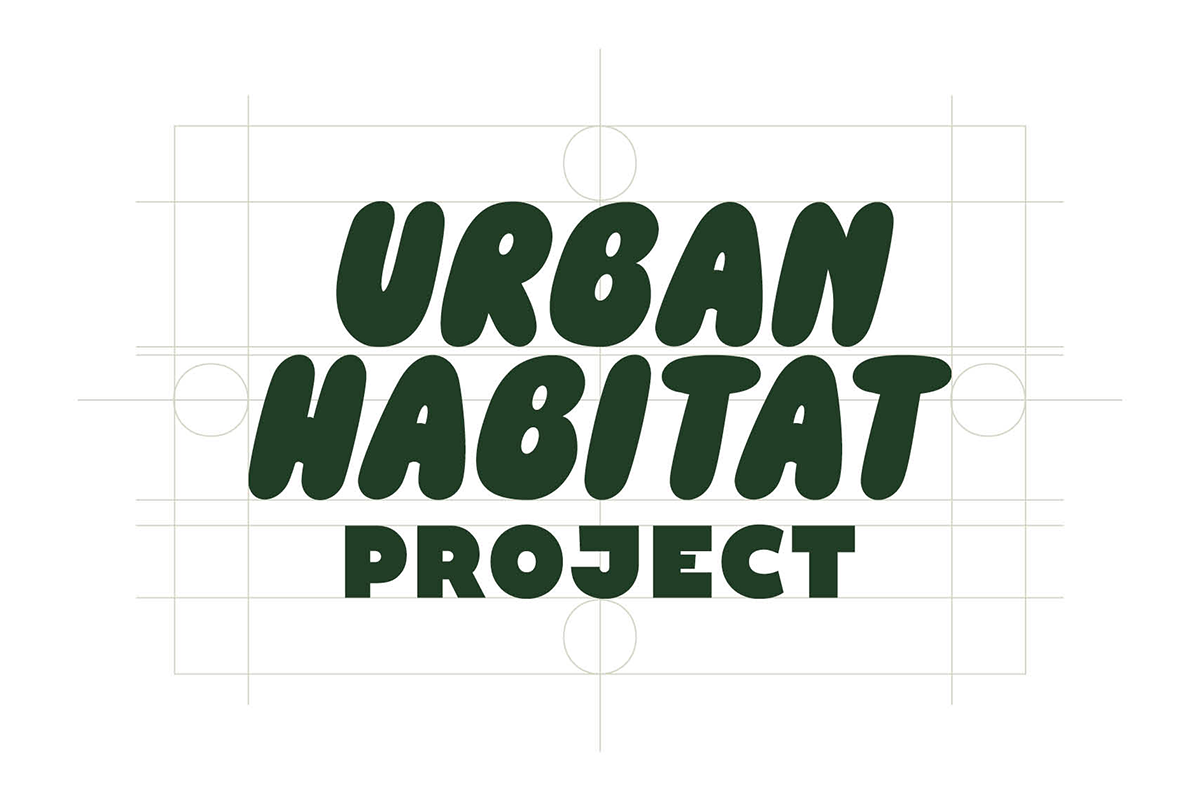
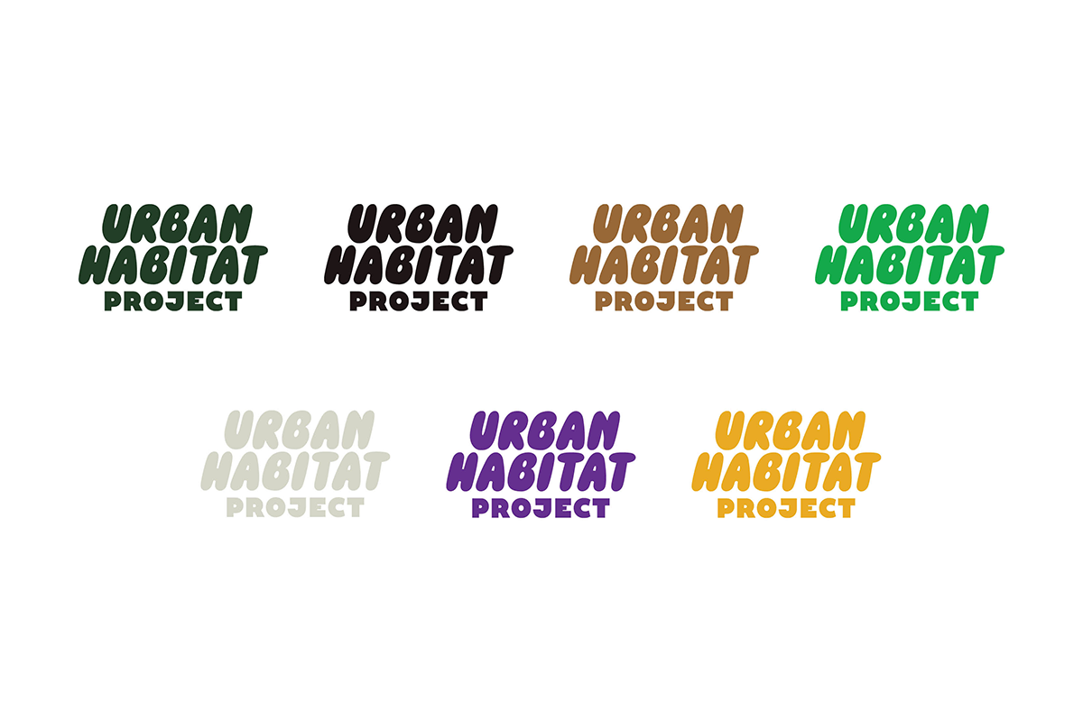
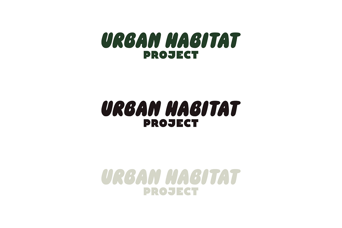
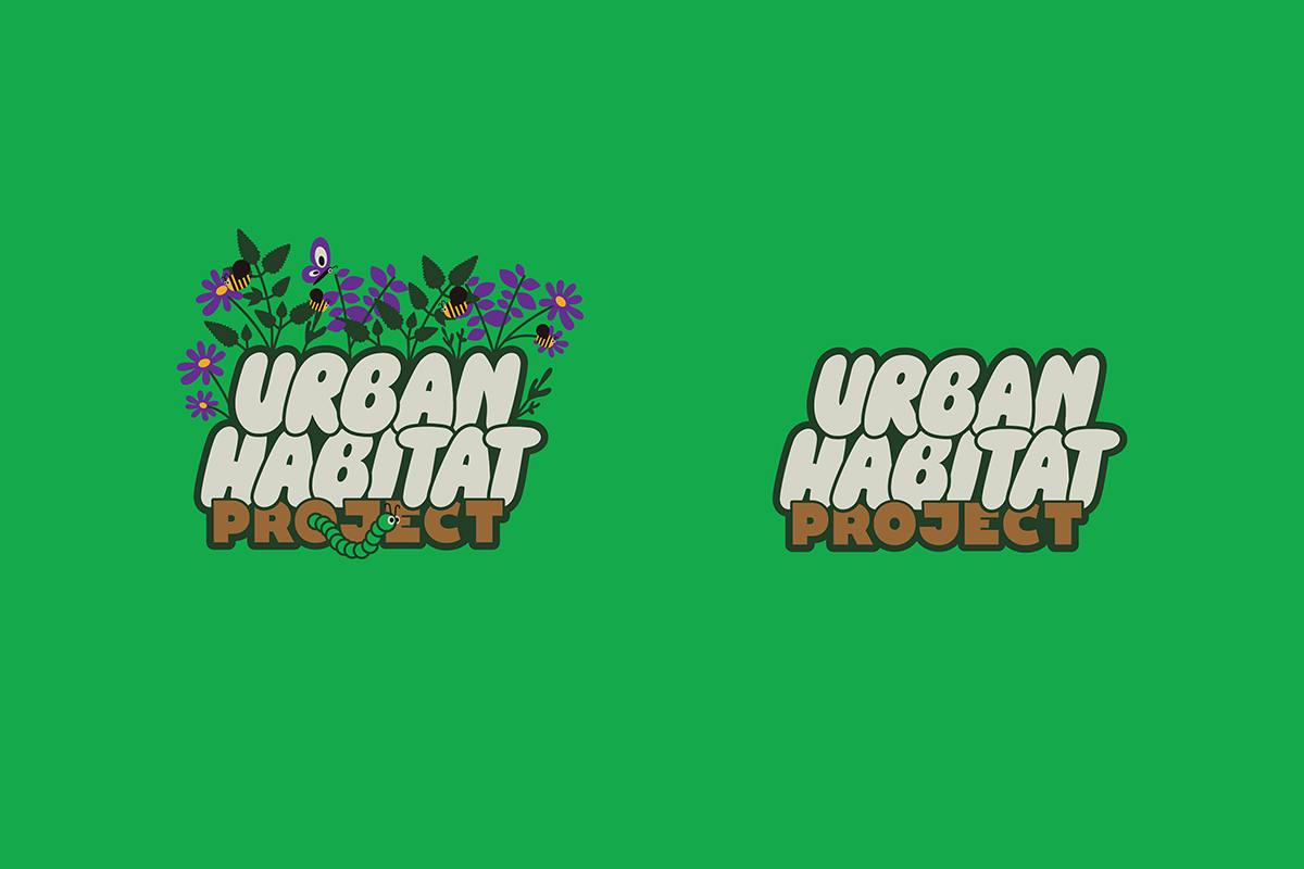
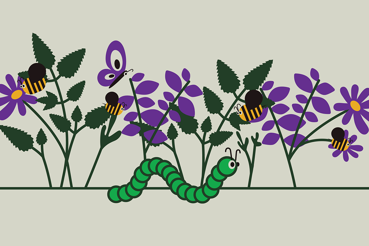
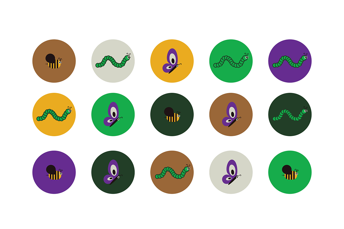
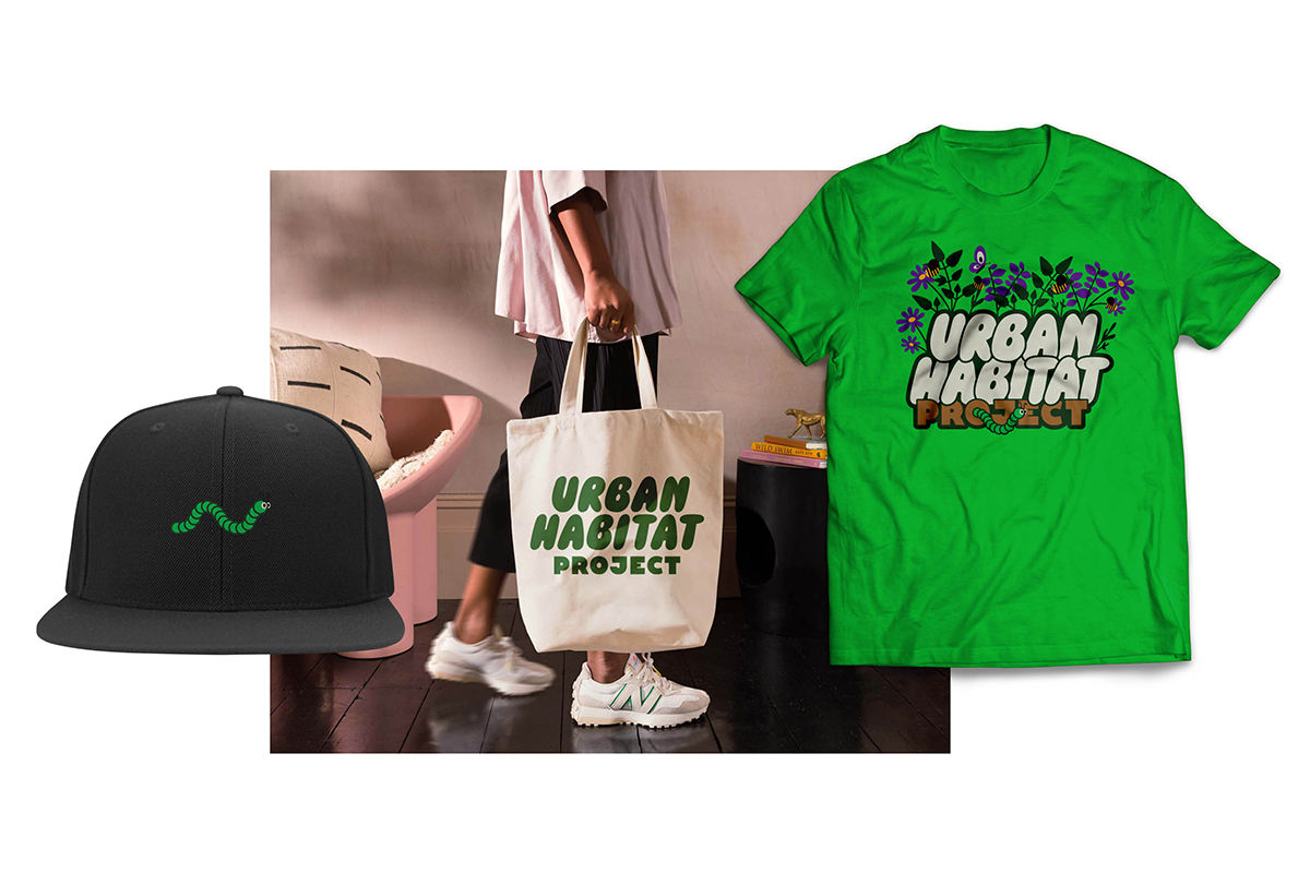
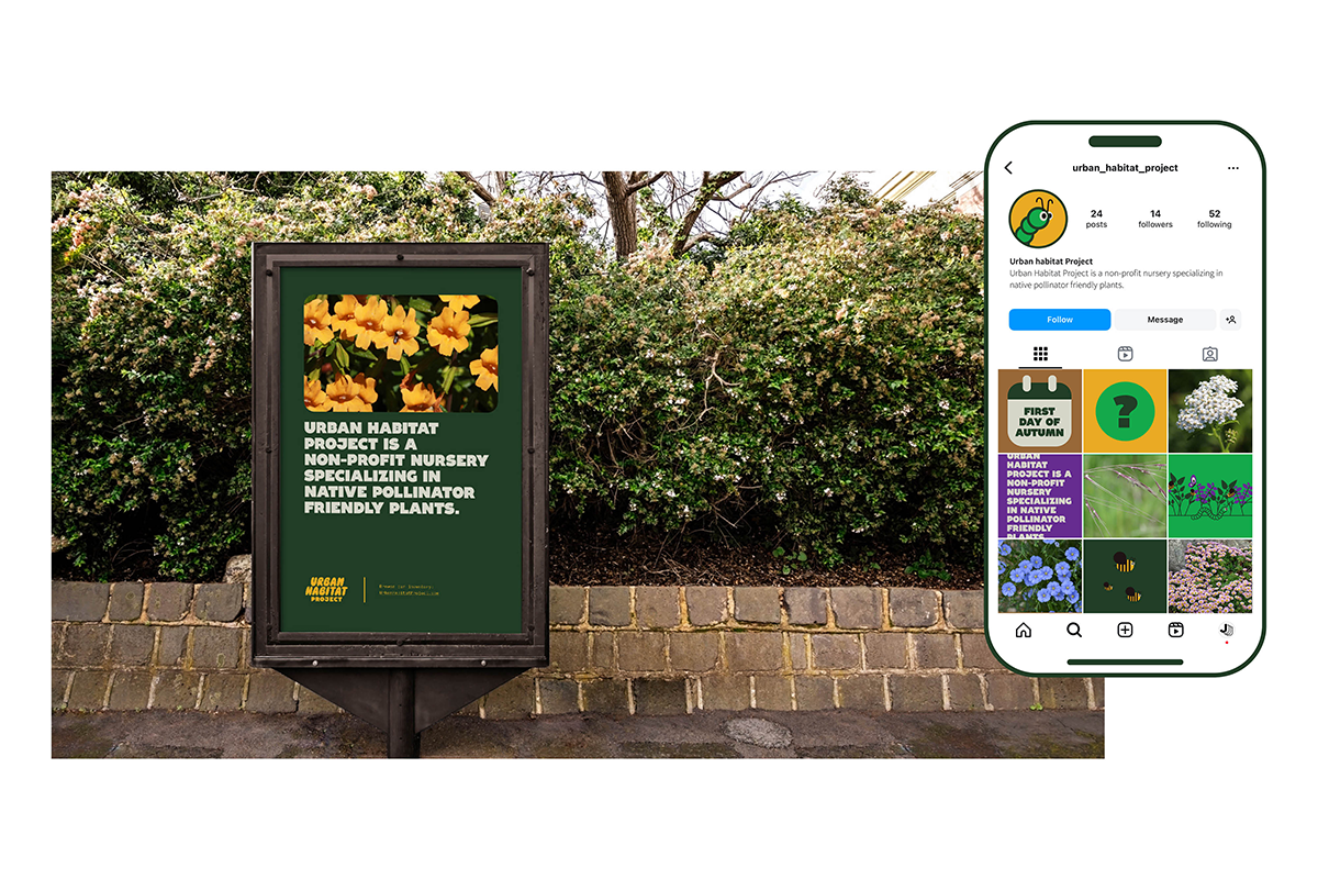
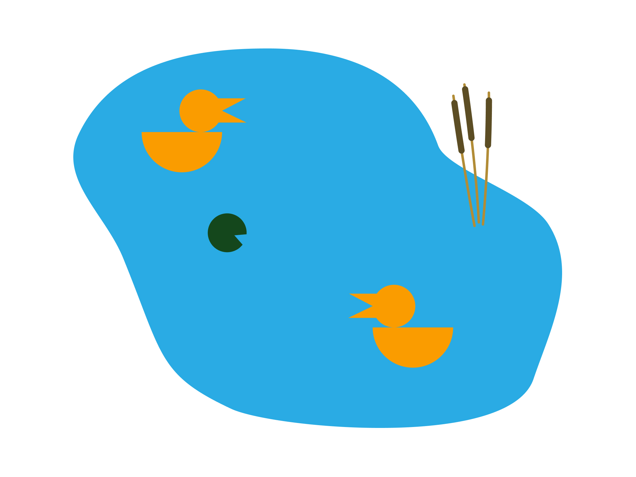
Brand identity for a Bay Area non-profit nursery specializing in native, pollinator-friendly plants. Urban Habitat's work spans plant donations, urban habitat restoration, and community education — all centered on preserving local flora and improving biodiversity in the region. The brand needed to reflect that mission honestly: grounded, community-rooted, and approachable without feeling generic. Built an identity that could work across signage, print, and outreach materials while staying true to the organization's neighborhood-level focus and the quiet importance of what they're actually doing.
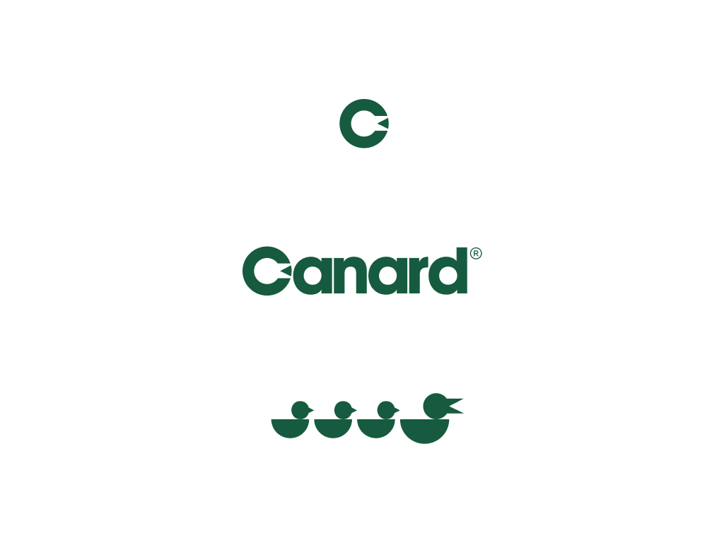
Canard is a creative studio and venture group with a portfolio spanning restaurants, cafes, wellness, fitness, hi-fi audio, and veterinary clinics. The through-line wasn't industry — it was a commitment to intuition-led, design-forward thinking at every level. As senior designer on a small founder-led team, the work went well beyond brand identity. We helped start businesses from scratch, designed interior spaces for restaurants, coworking offices, and clinics, and worked closely with founders to shape how their ideas came to life. A lot of these brands are rooted in Boulder, which added something extra — seeing the work out in the world in the place you actually live in is a different kind of satisfaction.

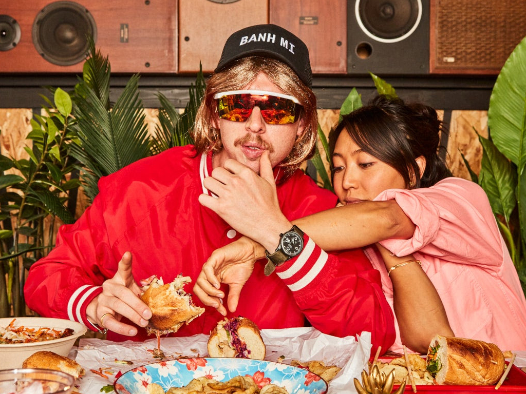
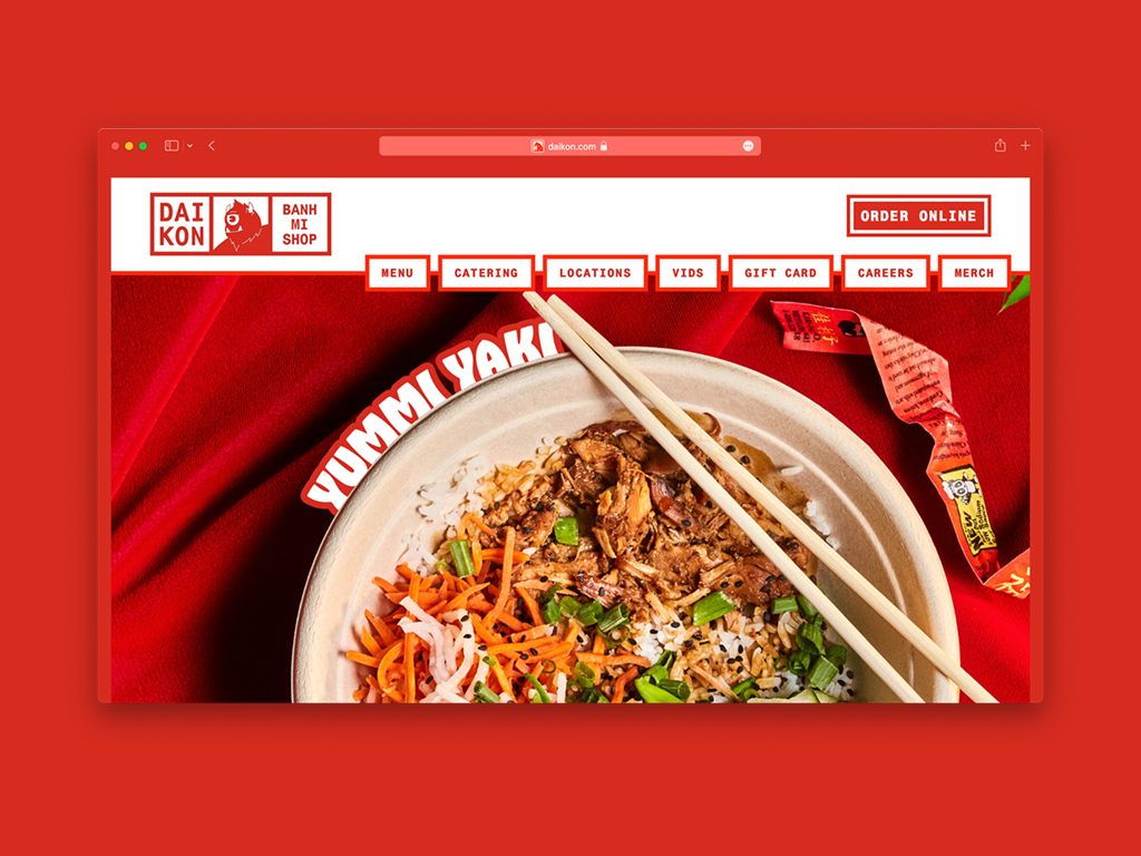
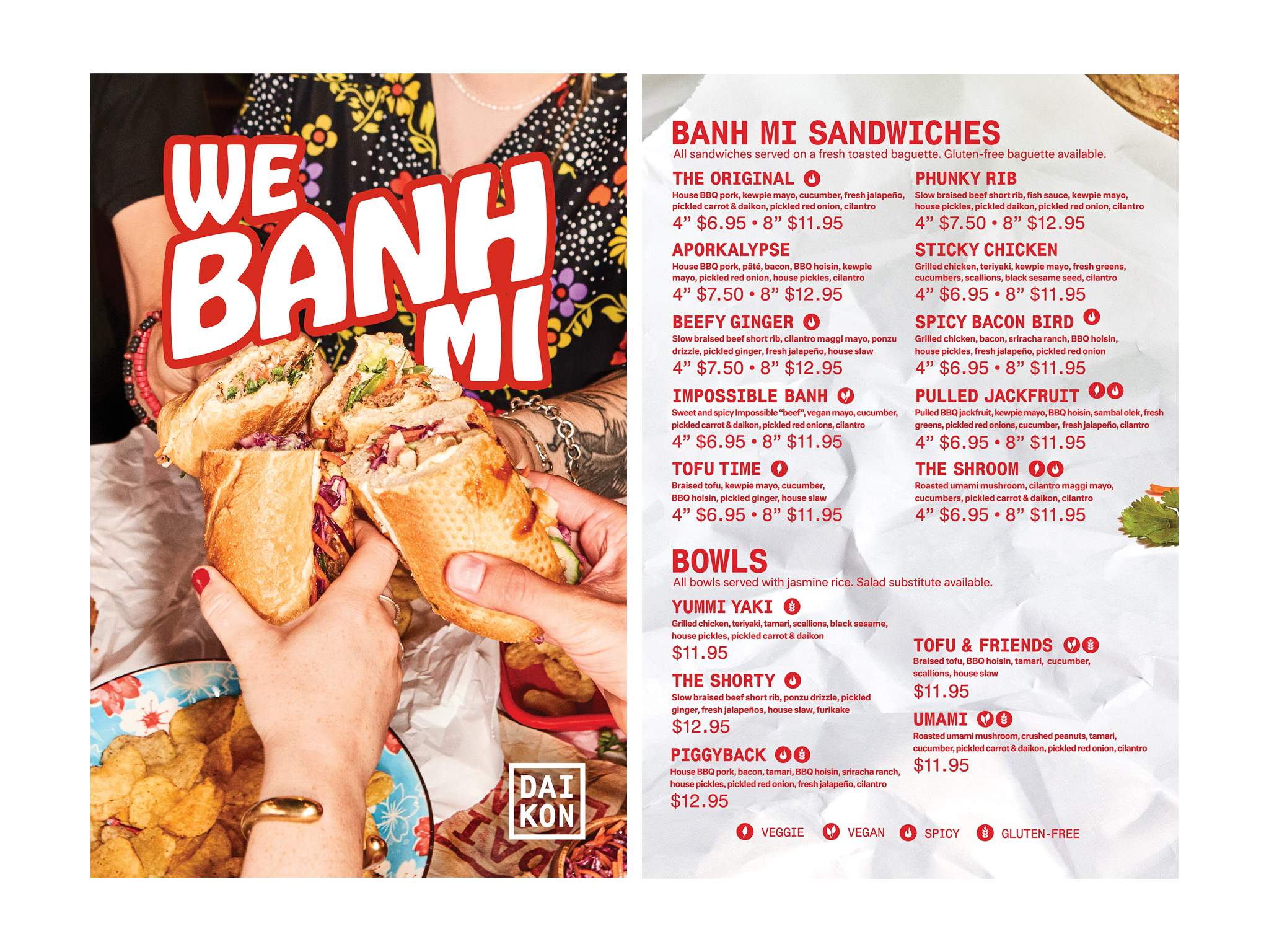
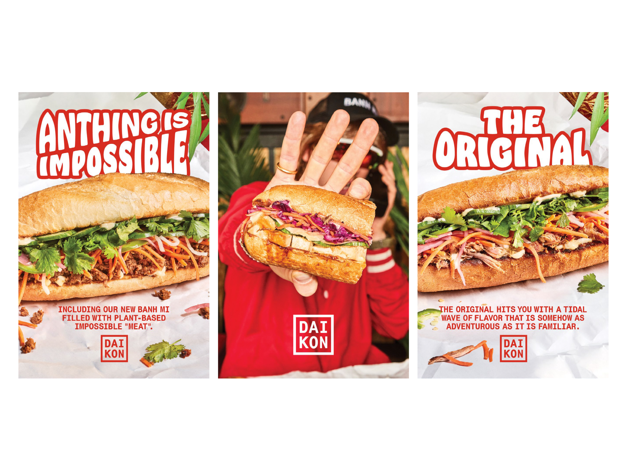
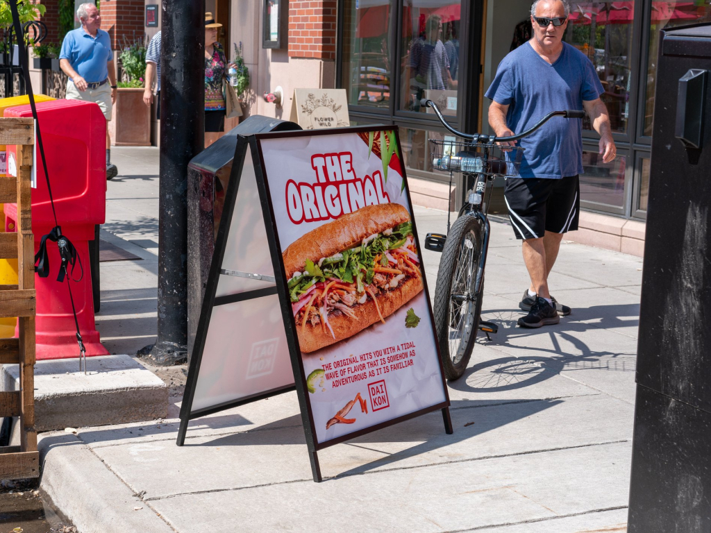
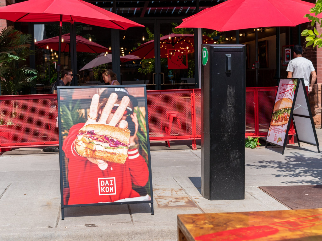
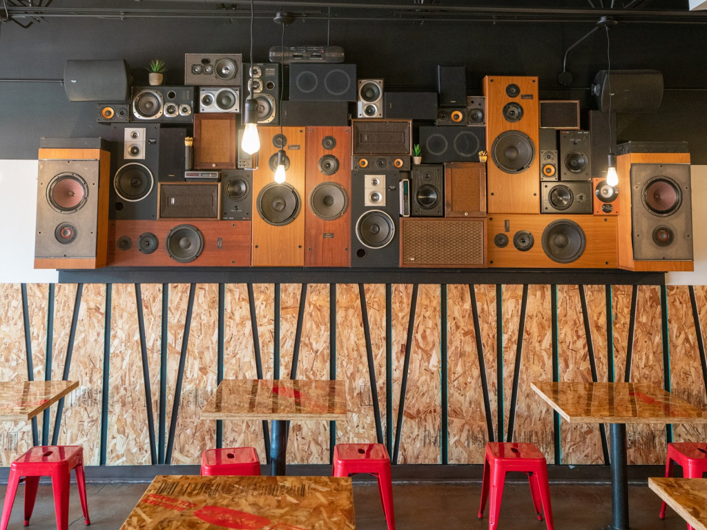
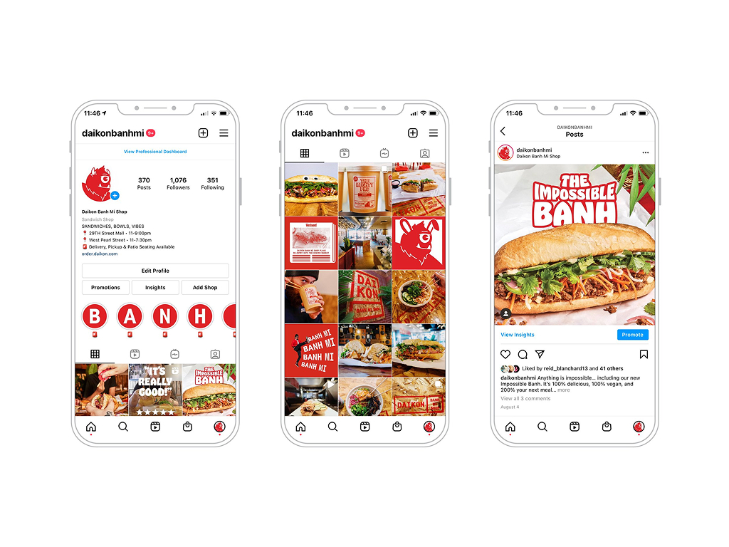
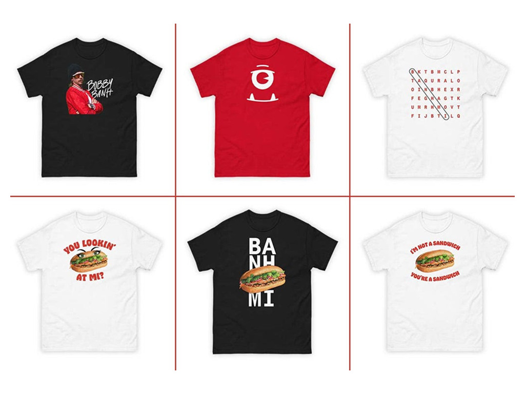
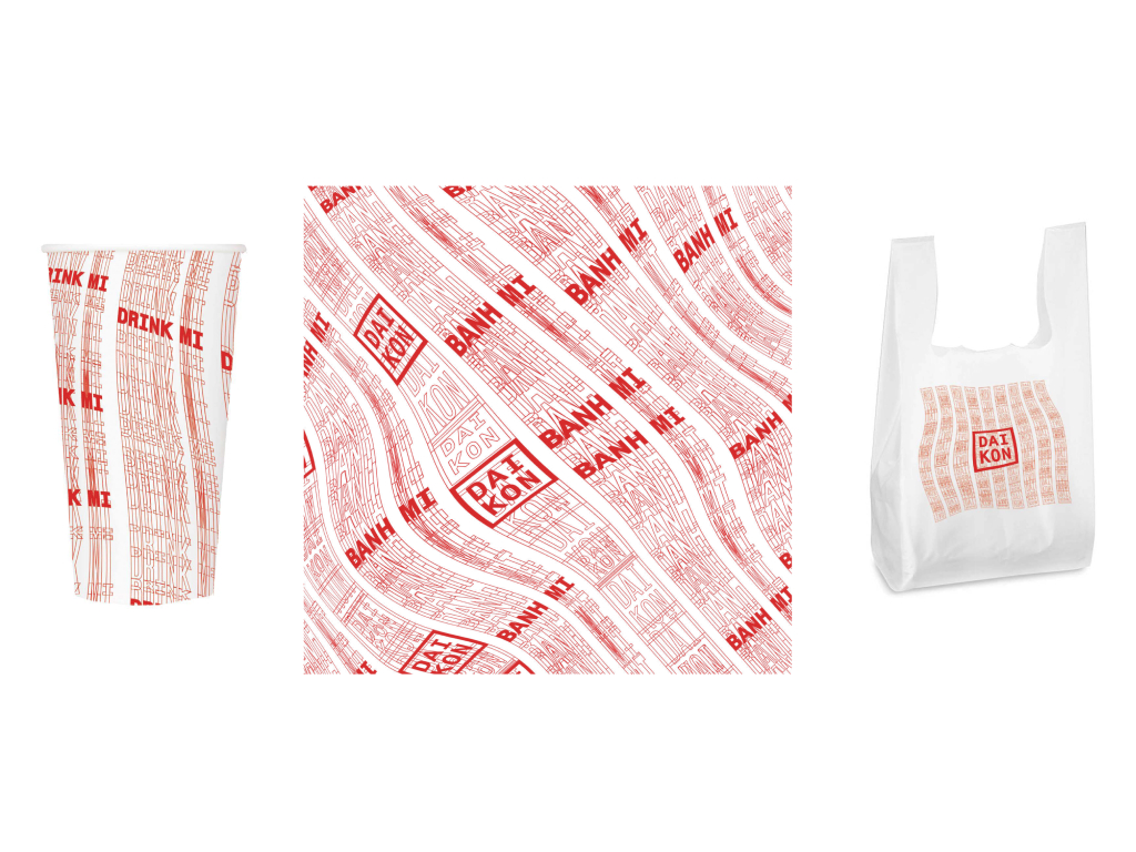
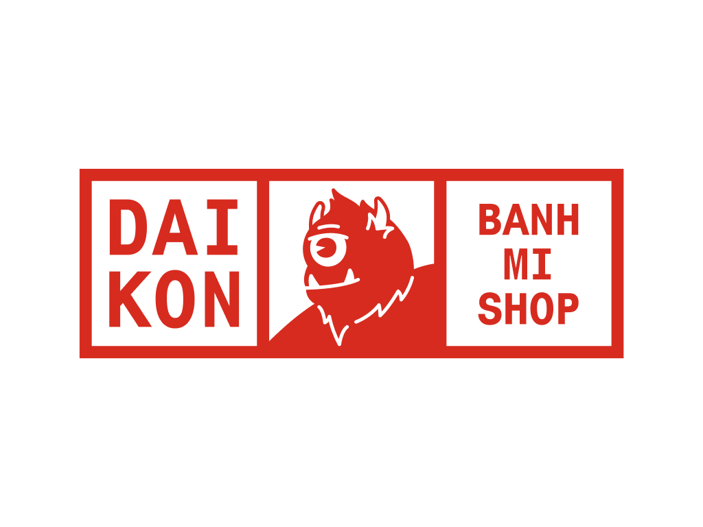
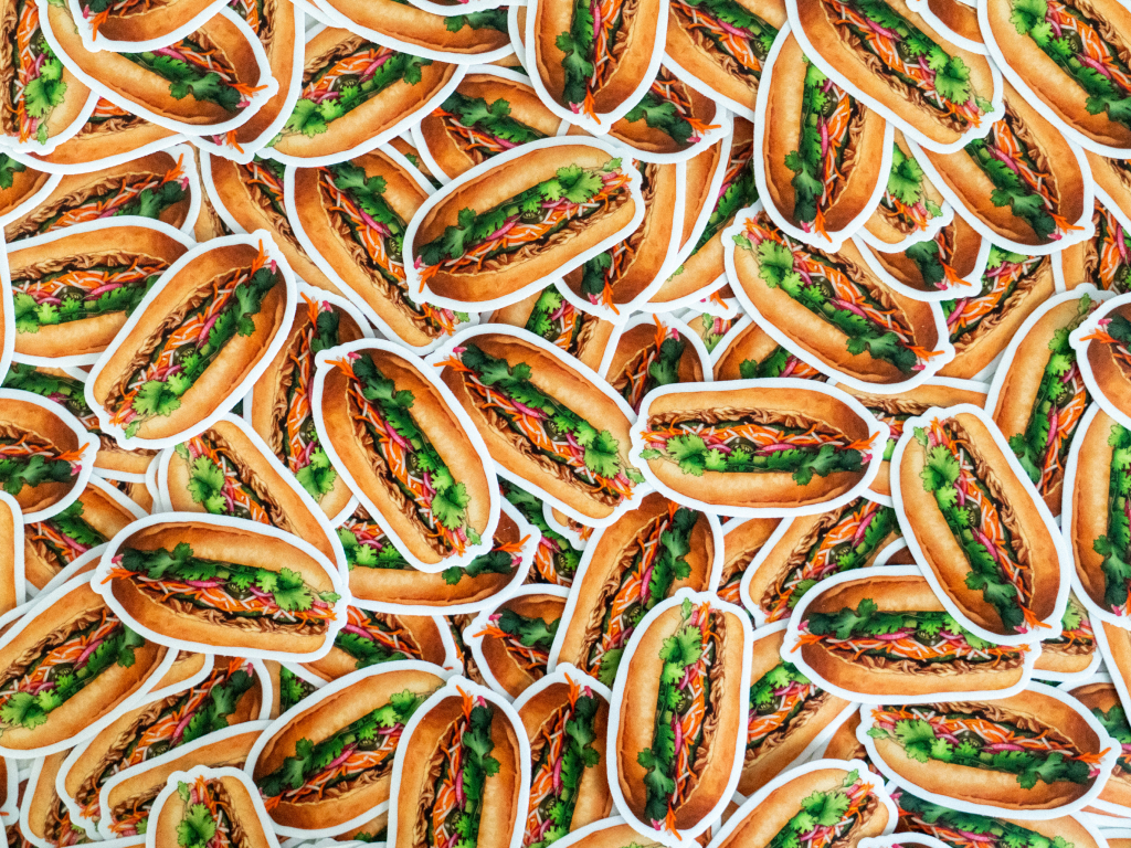
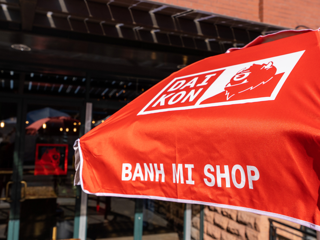
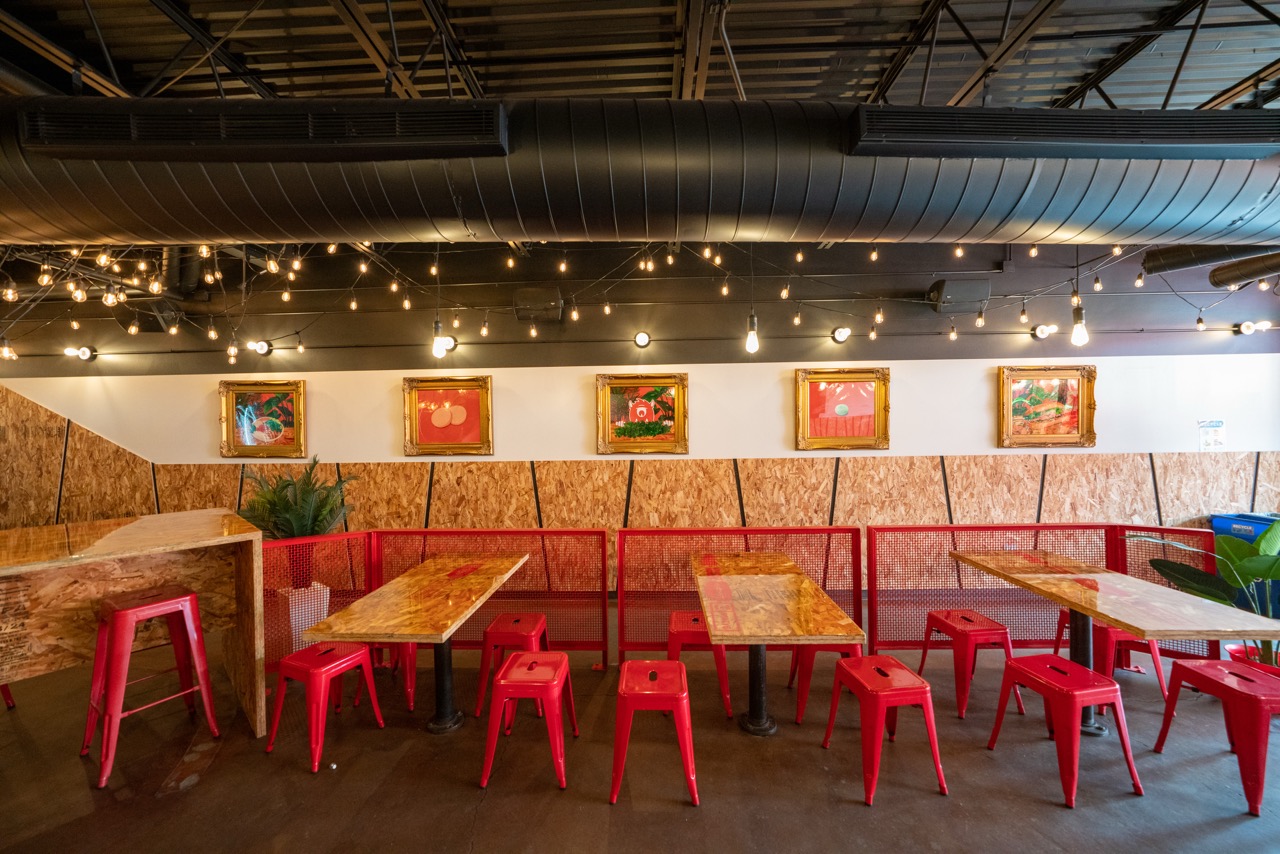
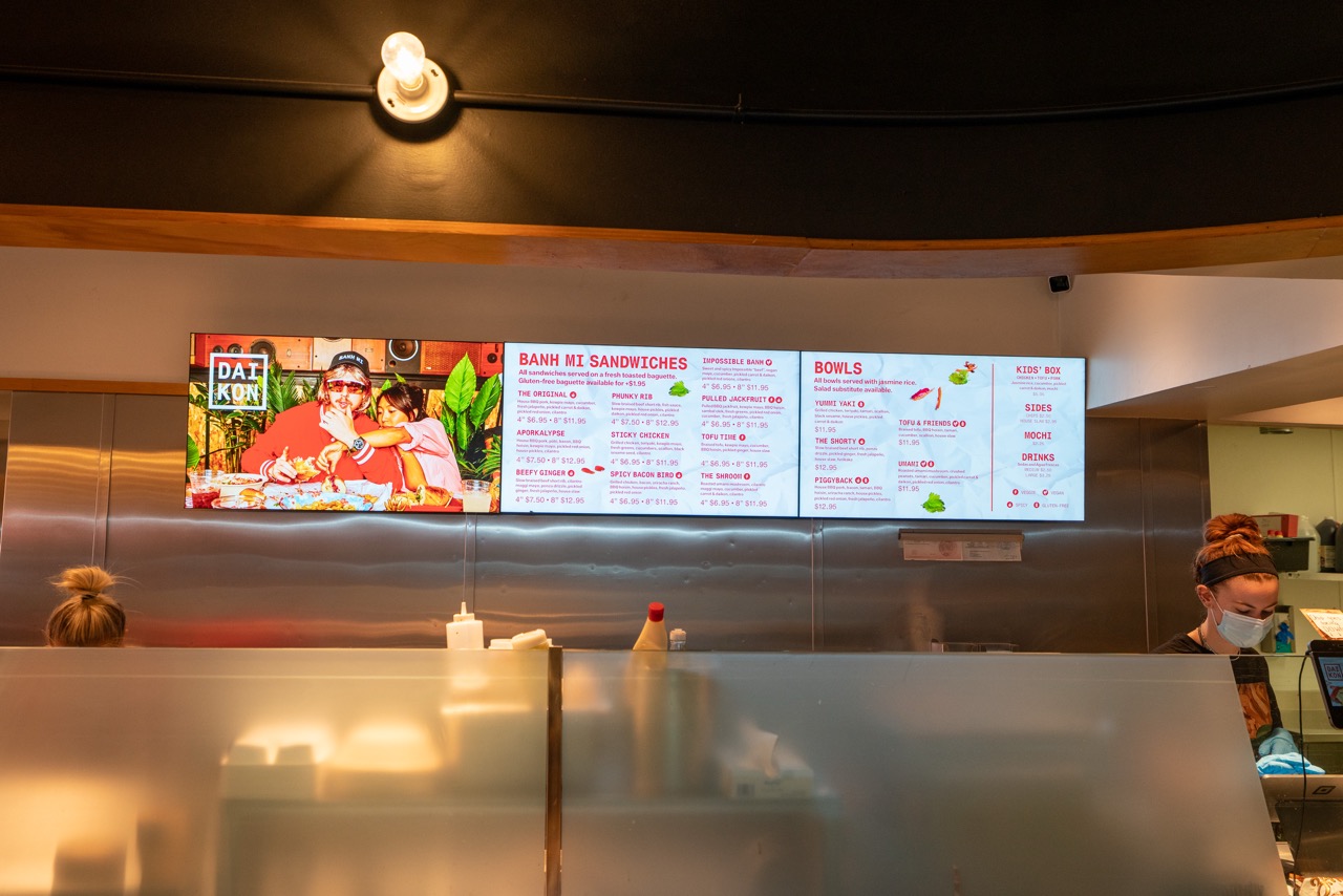
One of the brands built within Canard. Daikon started as a food truck serving banh mi-inspired sandwiches and grew into a two-location concept — born during COVID, which meant the brand had to be flexible from day one. The menu evolved, the hours changed, the operations shifted. The identity was built to move with it. Beyond the visual brand, a lot of the creative energy went into marketing through a YouTube channel of weekly shorts that built a genuinely engaged audience and community around the food and the people behind it. One of our best.

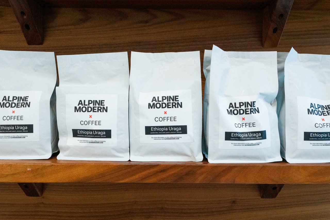
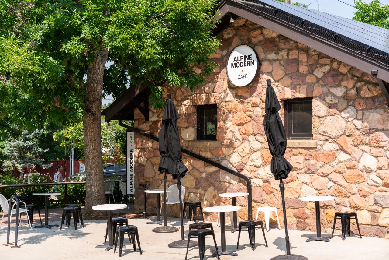
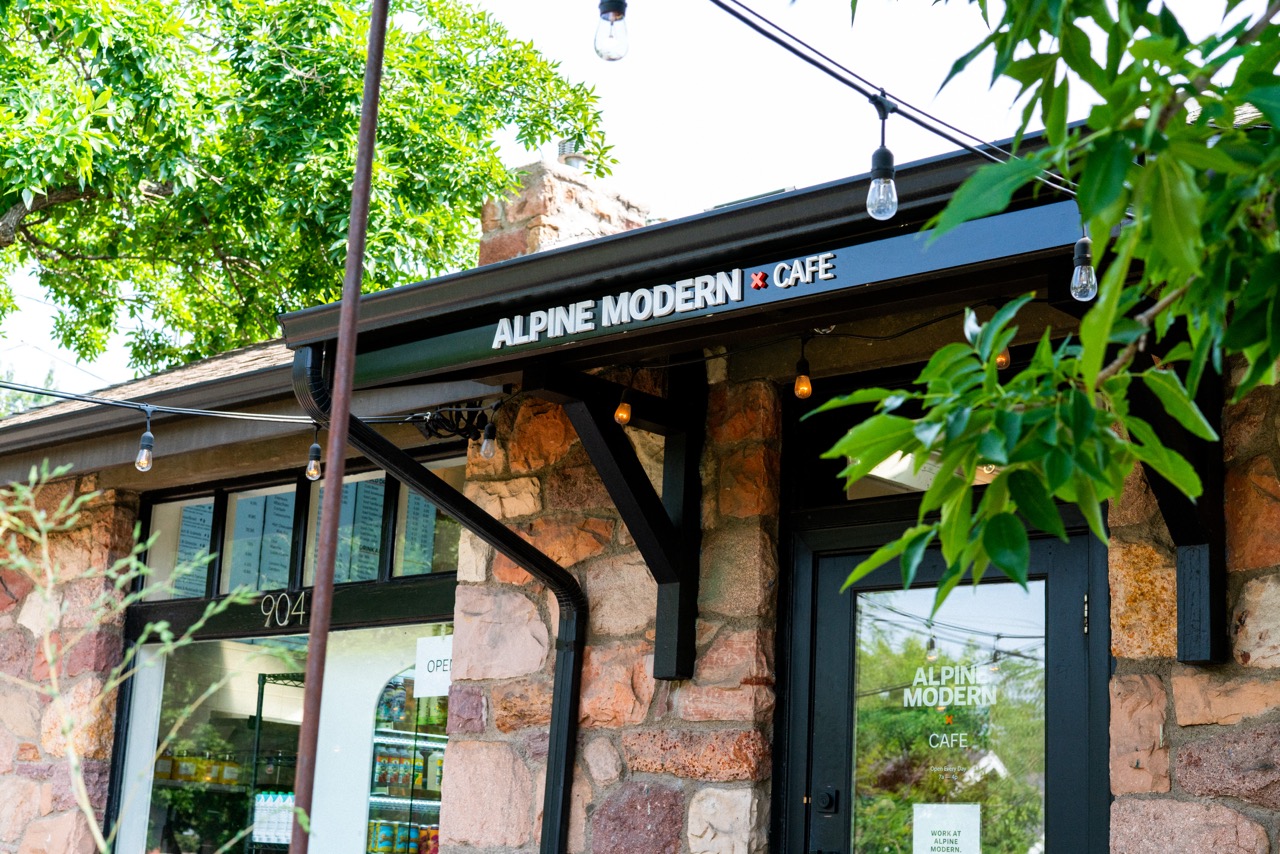
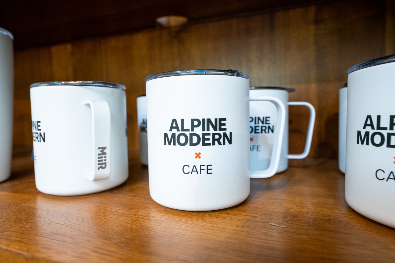
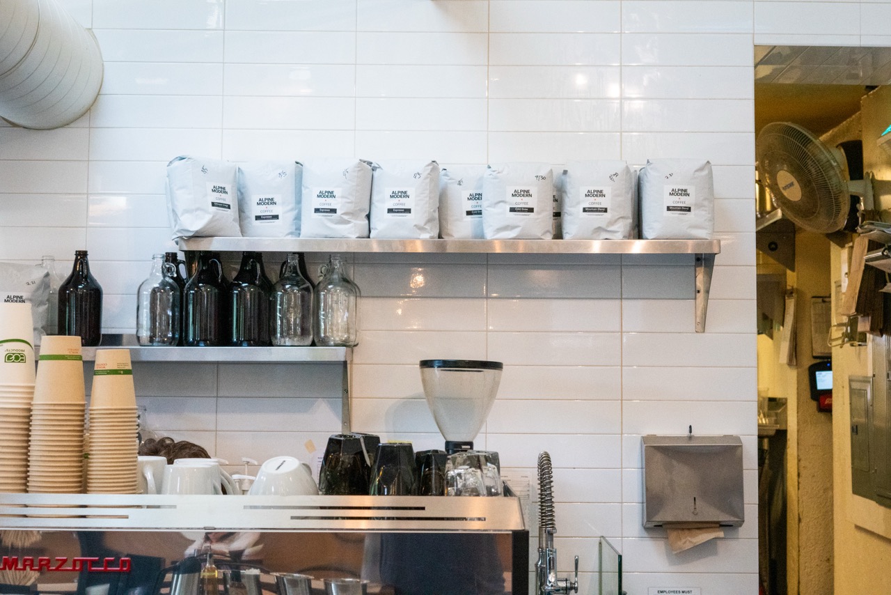
Alpine Modern started as a home goods store and Nordic design-inspired print publication founded by Canard's Lon McGowan, and evolved over the years into a coffee shop and cafe carrying the same sensibility through. The space, the branding, and the experience were all cut from the same cloth — minimal, considered, and rooted in a specific design point of view. Brand and environmental work that had to hold up across the full arc of what Alpine Modern became.

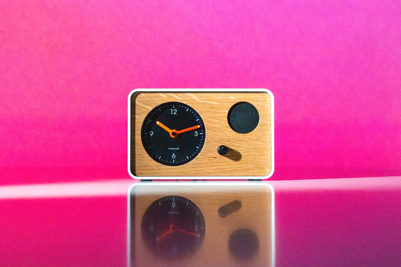
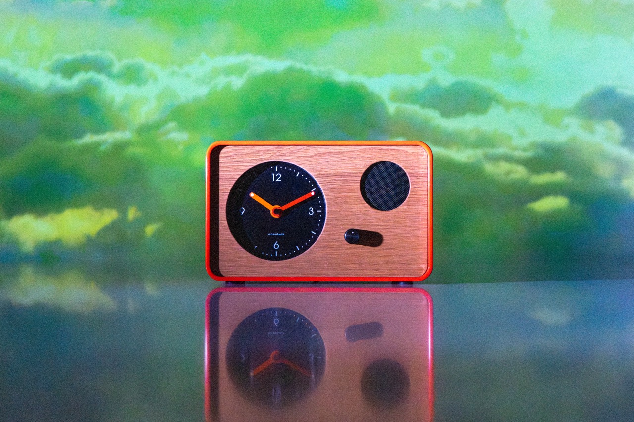
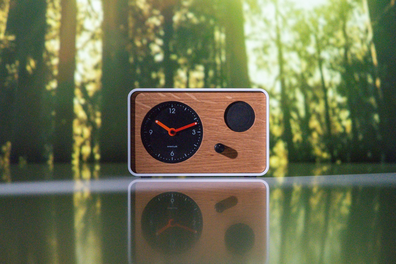
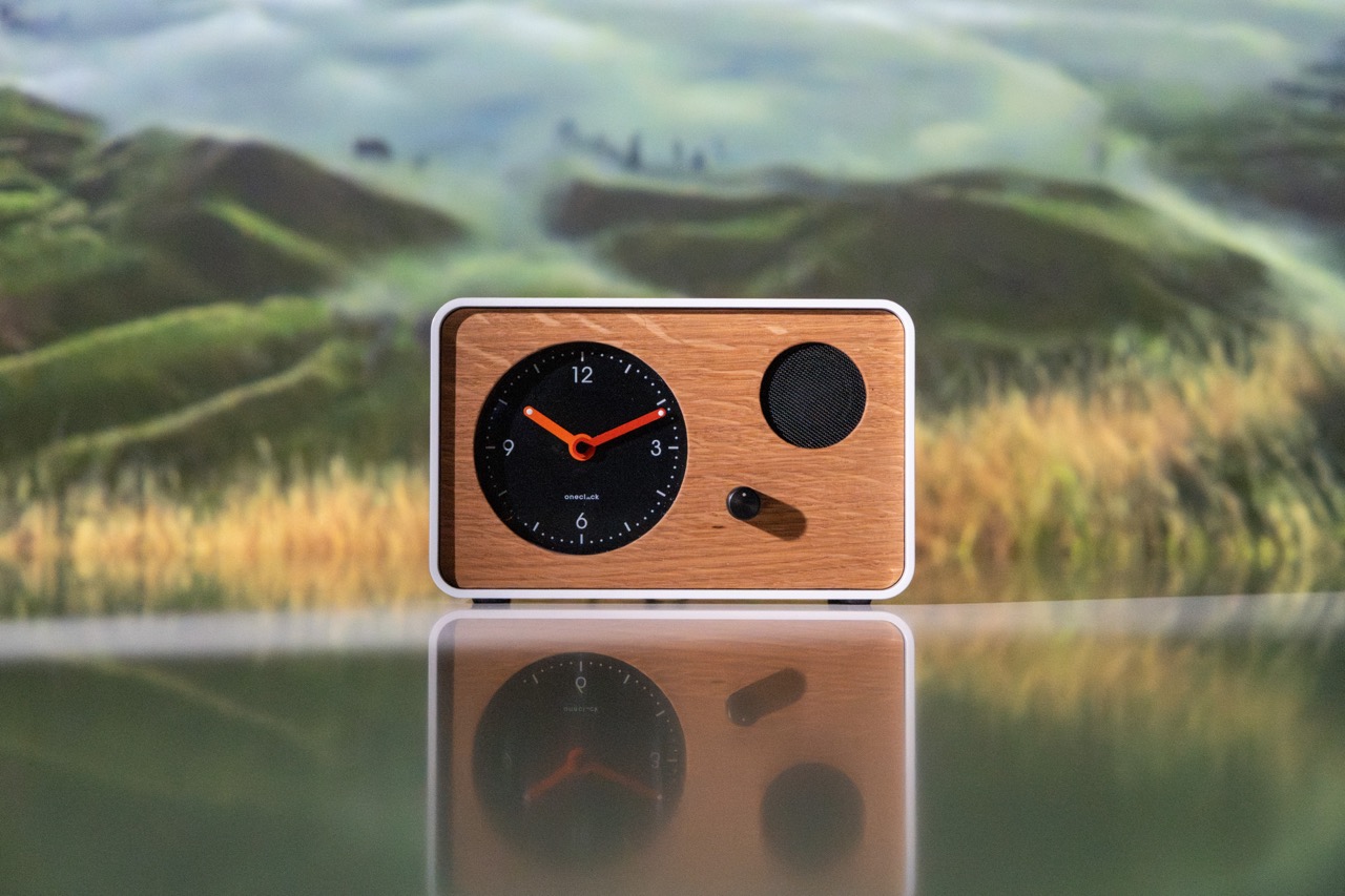
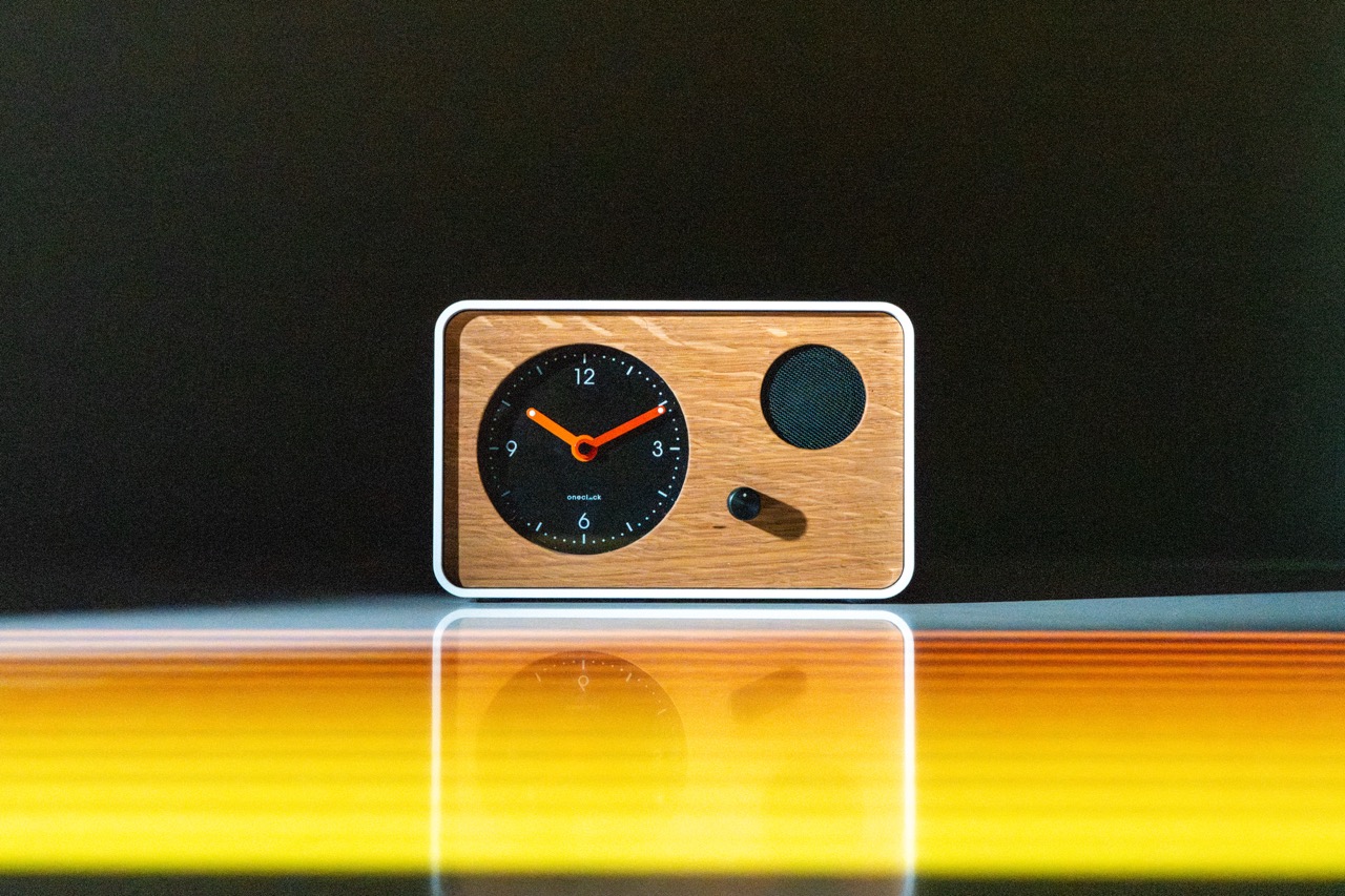
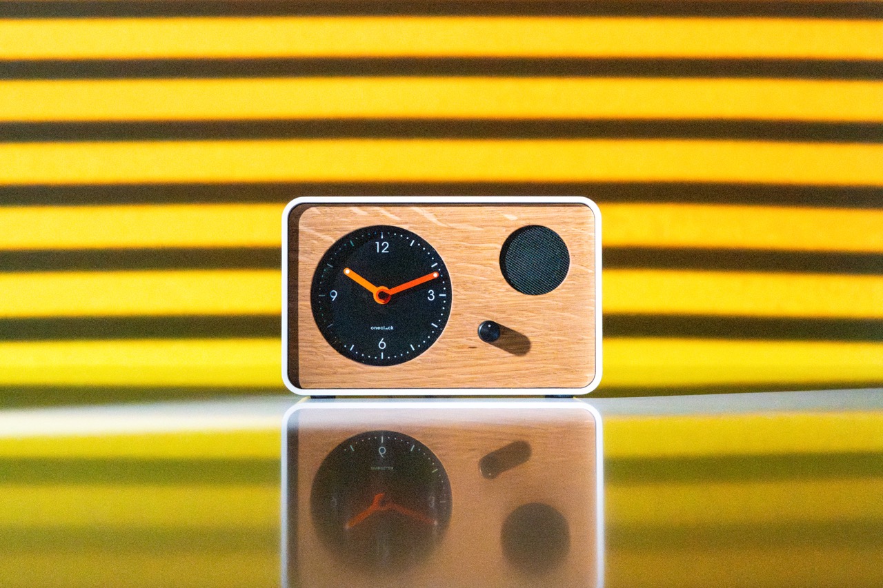
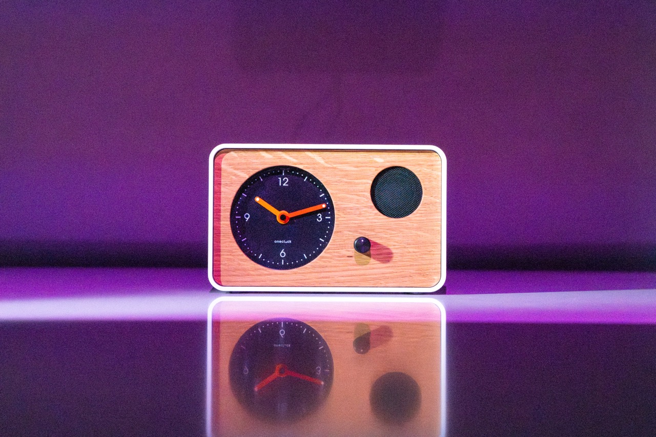
OneClock is a truly disconnected analog alarm clock that wakes you gently with exclusive music composed by human musicians — no phone, no notifications, no algorithm. Each day pulls from a set of layered tracks by War on Drugs' Jon Natchez, recombined differently every morning so it's familiar but never quite the same. Designed for optimal sleep and a more intentional start to the day. Through Canard, the work covered packaging design and a series of photos for marketing and advertising — a dreamlike photoshoot using surreal projections and vibrant color to capture something that felt more like waking from a good dream than an alarm going off.
© 2026 JJJJUSTIN. All rights reserved.
© 2026 JJJJUSTIN. All rights reserved.
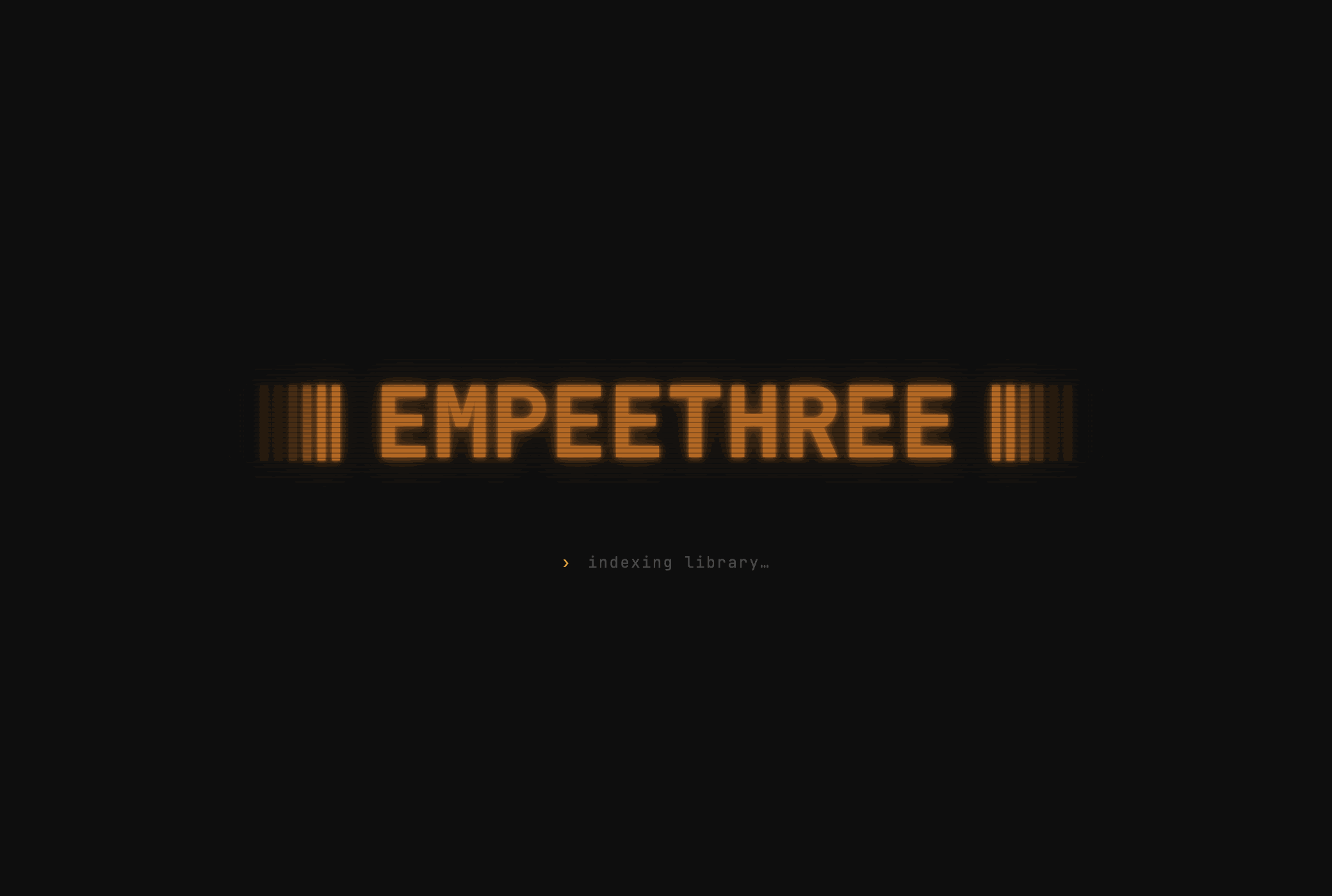
EMPEETHREE
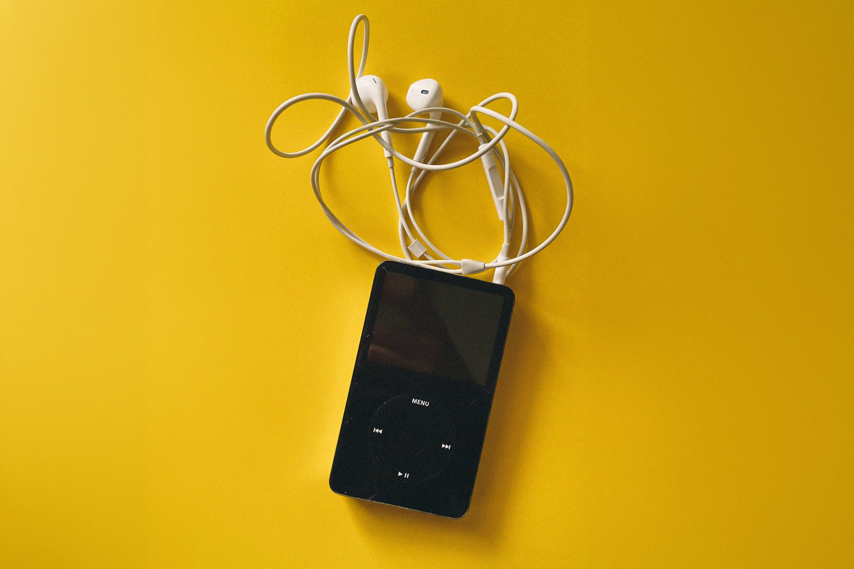
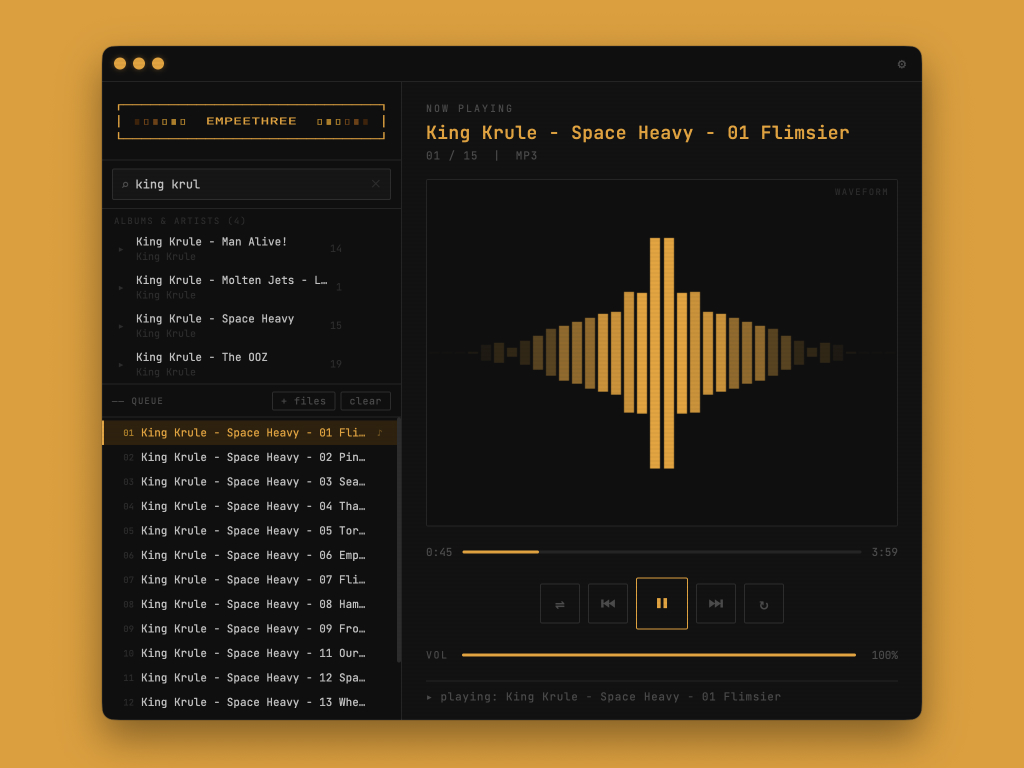
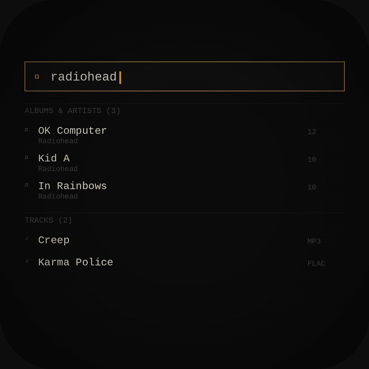
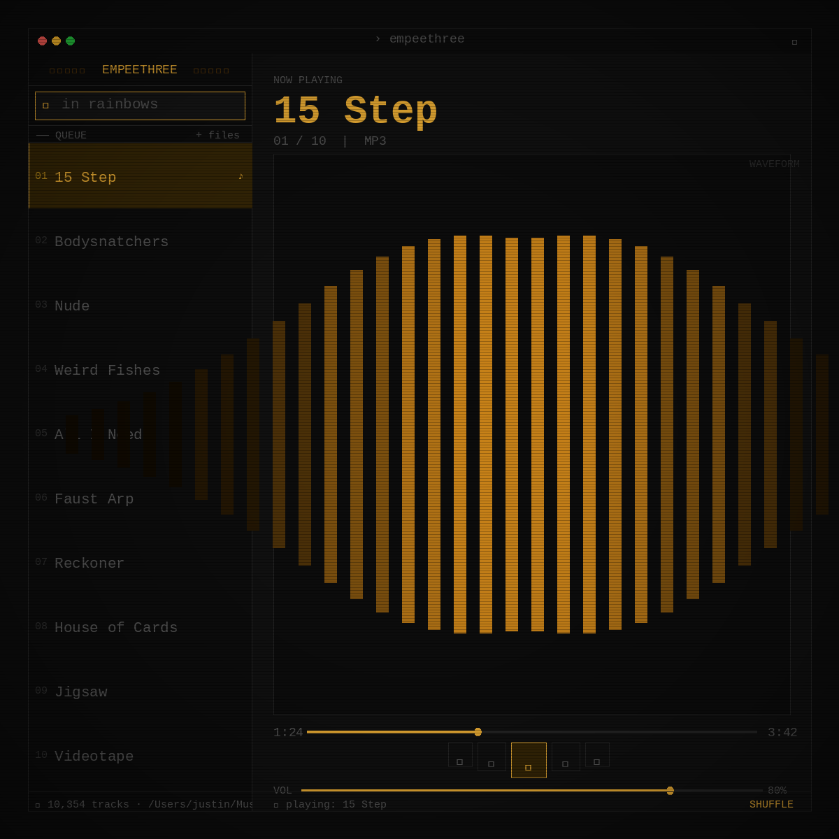
A desktop MP3 player built for people who own their music. No accounts, no streaming, no subscriptions. Just your files, played well.
EMPEETHREE started as a frustration with modern music players. Every app wants you to stream, subscribe, or surrender your library to the cloud. EMPEETHREE does none of that. It reads your local files, plays them without fuss, and gets out of the way.
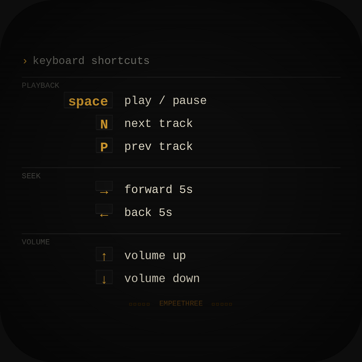
Built for macOS and Windows. Gapless playback, waveform scrubbing, keyboard-first controls. The interface is minimal by design. The music is the thing.
Currently in development. More details at empeethree.app.
© 2026 JJJJUSTIN. All rights reserved.